Brand guidelines
This brand guide defines the ENTERTAINER's visual identity, tone of voice and messaging, helping designers and copywriters use the brand consistently and effectively.
Logo
the ENTERTAINER's master logo is made up of two elements: the smiley face symbol and the wordmark “the ENTERTAINER”. All of the elements have a fixed size and position relative to one another, and so appear the same in every form and usage, for every audience.


Clear space and minimum size
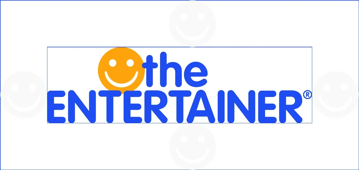
The minimum clearance around the logo should be equivalent to the diameter of the smiley icon.
The smallest acceptable print size for the logo is 7.5 mm in height. On digital screens, the minimum height of the logo is 20 px.
Logo don'ts
Keep the logo clear, consistent and recognisable. Do not stretch, distort, rotate, recolour, add effects, alter the proportions, rearrange its elements, or place it on backgrounds that reduce visibility.
Do not change the logo colour. 
Do not distort or warp the logo in any way. 
Do not rotate the logo. 
Do not use the wordmark without the smiley icon. 
Do not alter the composition of the logo. 
Do not outline or create a keyline around the logo.
Visibility
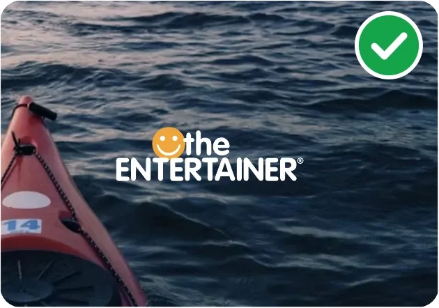
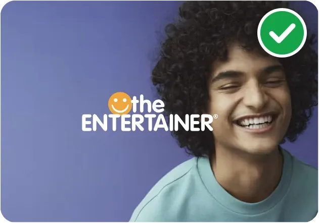
The logo can be placed on solid-colour backgrounds or photographic images. Use the white logo on darker backgrounds and the blue logo on lighter backgrounds.
Avoid placing the logo over busy or high-contrast areas, and do not use it on the ENTERTAINER Yellow background.
The smiley
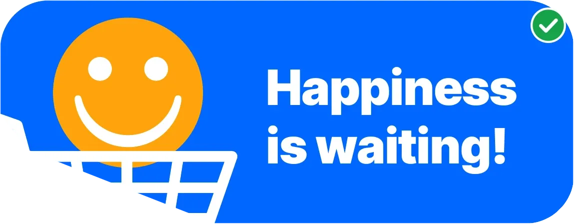
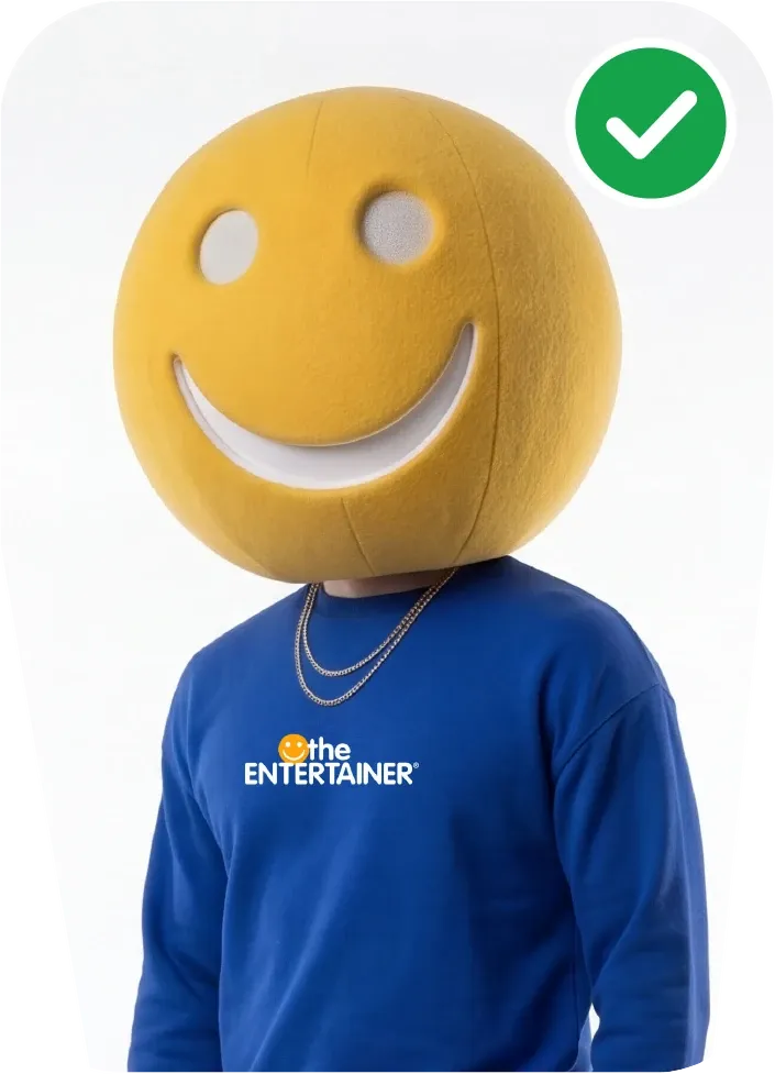
The smiley must never be used as a standalone brand identifier or as a replacement for the official logo. It may be used as a supporting graphic element across the ENTERTAINER's communications to reinforce the brand's personality.
The smiley must not be altered, distorted or modified in any way. Exceptions are permitted for animation, provided the smiley returns to its original, approved form at the end of the sequence.
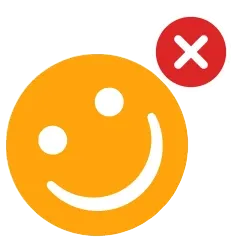
Do not rotate it. 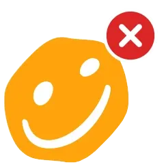
Do not warp or distort it. 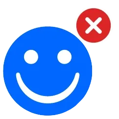
Do not alter the colour. 
Do not modify it. 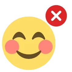
Do not replace it with another smiley.
Colours
the ENTERTAINER's primary colour is Blue, supported by Yellow Ochre as the secondary colour and Pink as an accent. Lighter washes of these colours may be used for backgrounds, watermarks and graphic separators.
- Blue
- HEX
- #0866FF
- RGB
- 8 102 255
- CMYK
- 82.34 59.56 0 0
- Yellow Ochre
- HEX
- #FEA30B
- RGB
- 254 163 11
- CMYK
- 0 45.74 100 0
- Pink
- HEX
- #F99BBD
- RGB
- 249 155 189
- CMYK
- 0 53.43 1.46 0
- Wash Blue
- HEX
- #D7E7FF
- Wash Yellow
- HEX
- #FFE2C0
- Wash Pink
- HEX
- #FFEBF7
- White
- HEX
- #F9F9F9
- Grey
- HEX
- #E6E7E8
- Black
- HEX
- #000000
- RGB
- 0 0 0
- CMYK
- 74.97 67.92 67.05 90.15
The colour values provided are intended for screen use and digital printing only. For solid spot-colour printing, select and approve the closest match from the printer's physical colour swatch book.
Text colours on backgrounds
When using the ENTERTAINER colours as backgrounds or text containers, choose a text colour that provides clear contrast for easy readability. Use the recommended combinations below for each background colour.
For text at any size
- BlueBlack
White
- White
Blue
For large text only
- Yellow OchrePink
White
- Yellow OchreWash YellowWash Blue
Blue
- BlueWhite
Yellow Ochre
- BlueYellow Ochre
Wash Blue
- Blue
Wash Yellow
- WhiteBlue
Pink
Typography
English font
Our English fonts bring clarity and personality to the ENTERTAINER's communications. Follow this guide to use the correct typefaces, weights and sizes, keeping every layout consistent and easy to read.
- Headline, Inter Tight Black
- Inter Tight Black
- Subhead, Inter Tight Bold
- Inter Tight Bold
- Body copy, Noto Sans Regular
- Noto Sans Regular
Arabic font
Our Arabic fonts reflect the ENTERTAINER's personality while complementing our English typography. Follow this guide to use the correct typefaces, weights and sizes, keeping every layout consistent and easy to read.
- Headline, Aktiv Grotesk Black
- أكتيف غروتسك أسود ثقيل
- Subhead, Aktiv Grotesk Bold
- أكتيف غروتسك عريض
- Body copy, Noto Sans Arabic Regular
- نوتو سانس عادي
Text hierarchy
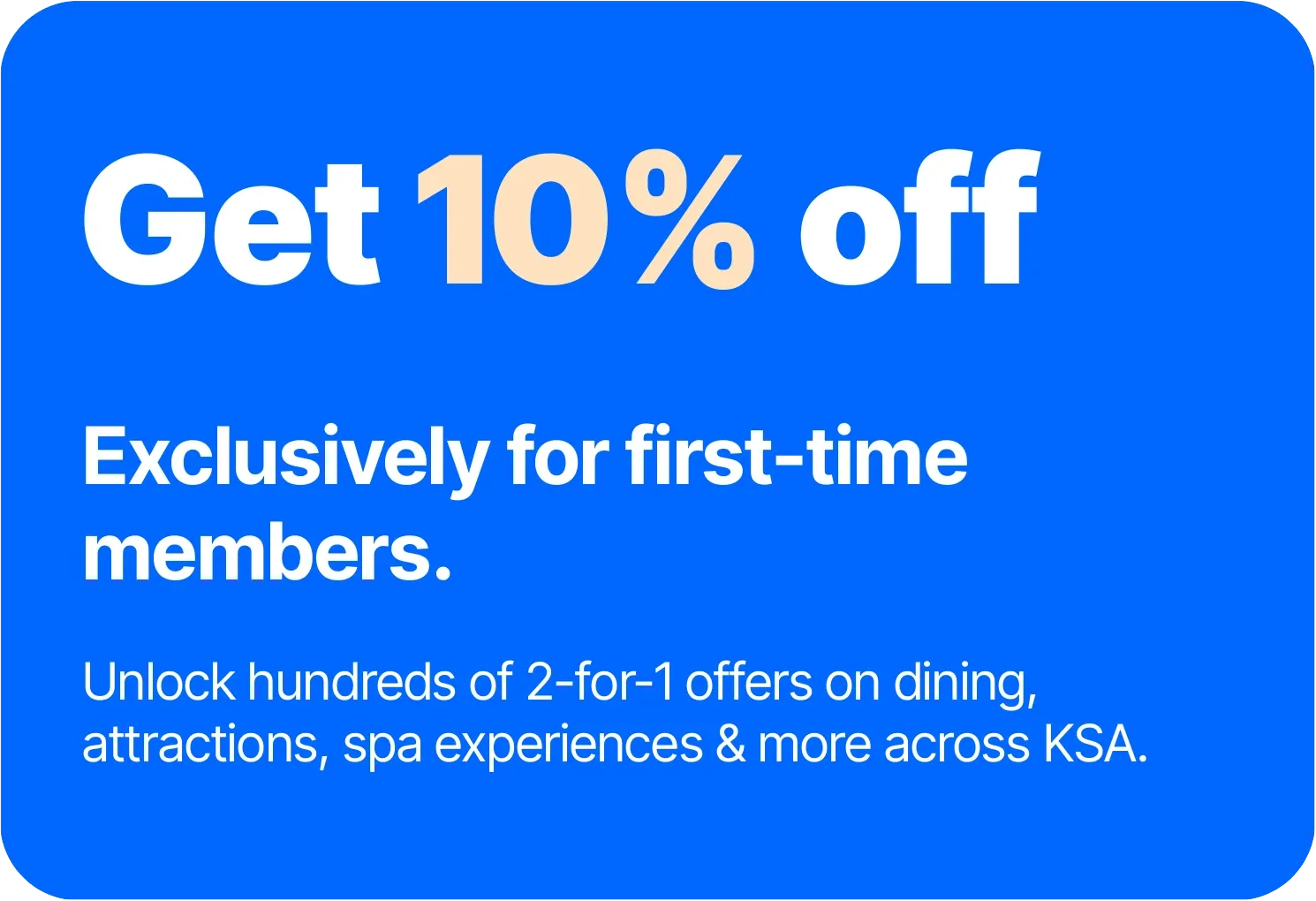
Maintain a clear size hierarchy between the headline, subheadline and body copy to make messaging easy to read and understand. Avoid random text sizes, which can make the layout feel cluttered and disrupt the reading flow.
Headlines should not end with a full stop. Subheadlines and body copy should use a full stop at the end of each sentence.
- HeadlineInter Tight Black120 pt
- SubheadlineInter Tight Bold54 pt
- Body copyNoto Sans Regular35 pt
Getting the fonts
- Inter TightOpen Font Licence. Download the font files here.
- Noto SansOpen Font Licence, from Google Fonts.
- Noto Sans ArabicOpen Font Licence, from Google Fonts.
- Aktiv Grotesk ArabicA commercial typeface, licensed from Dalton Maag.
Get Out. Get More. Get the ENTERTAINER.
“Get Out. Get More. Get the ENTERTAINER.” encourages people to step beyond the convenience of delivery and enjoy experiences outside their homes. “Get Out” inspires them to explore. “Get More” promises more experiences and value for their money. “Get the ENTERTAINER” introduces the brand that makes it all possible.
Tagline usage
- When using the tagline with the logo, use only “Get Out. Get More.”
- As a headline in horizontal layouts, keep it on one line and centre-aligned.
- As a headline in square or vertical layouts, keep it left-aligned.
- As part of the logo lockup, keep it on one line, matching the width of the logo.
With the logo 
Horizontal layout 
Vertical layout
How we speak
Tone of voice is not what we say but how we say it. How we phrase something changes the outcome and how a customer perceives the brand.
- Fun
- Trustworthy
- Sociable
- Honest
Our personality is fun, trustworthy, sociable and honest. We're all about one thing, the app, and about shared experiences as well as savings.
We talk to people, not audiences, to build a more personal relationship with our users. People want a consistent personality, not a faceless voice, so keep it consistent throughout.
Our name
Always write the ENTERTAINER, in exactly this capitalisation. Never shorten it to TE.
Updates
Instead ofAs we are constantly adding new merchants, we are always updating our offers, and you will be notified when we do.
WriteGrowing pains? More like growing gains. As we grow, we'll keep updating your offers and let you know when we do so.
Errors
Instead ofWe are experiencing some technical difficulties, and we are trying to resolve the issue. We apologise for any inconvenience caused.
WriteOops, sorry. Nothing to worry about. We're just doing a quick fix and will be back with you soon.
Campaign messaging
Campaign messaging builds on our tagline, pairing “Get” with an action word to create headlines that encourage people to get out, try new experiences and enjoy life with the ENTERTAINER.
GetCELEBRATINGPAMPEREDBRUNCHINGTHRILLEDINDULGING
The tagline extends into two-word messages that reflect each category. Always write Get with an initial capital and the following word in UPPERCASE.
There are three ways to apply category messaging:
- Split: “Get” outside, action word inside.
- Stacked: both inside, on two lines.
- Inline: both inside, on one line.
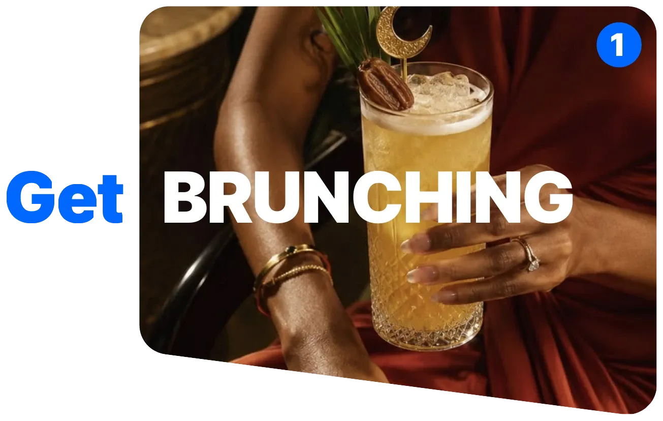
1. Split 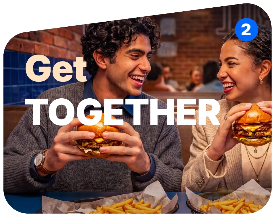
2. Stacked 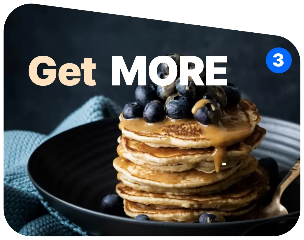
3. Inline
Standard messaging
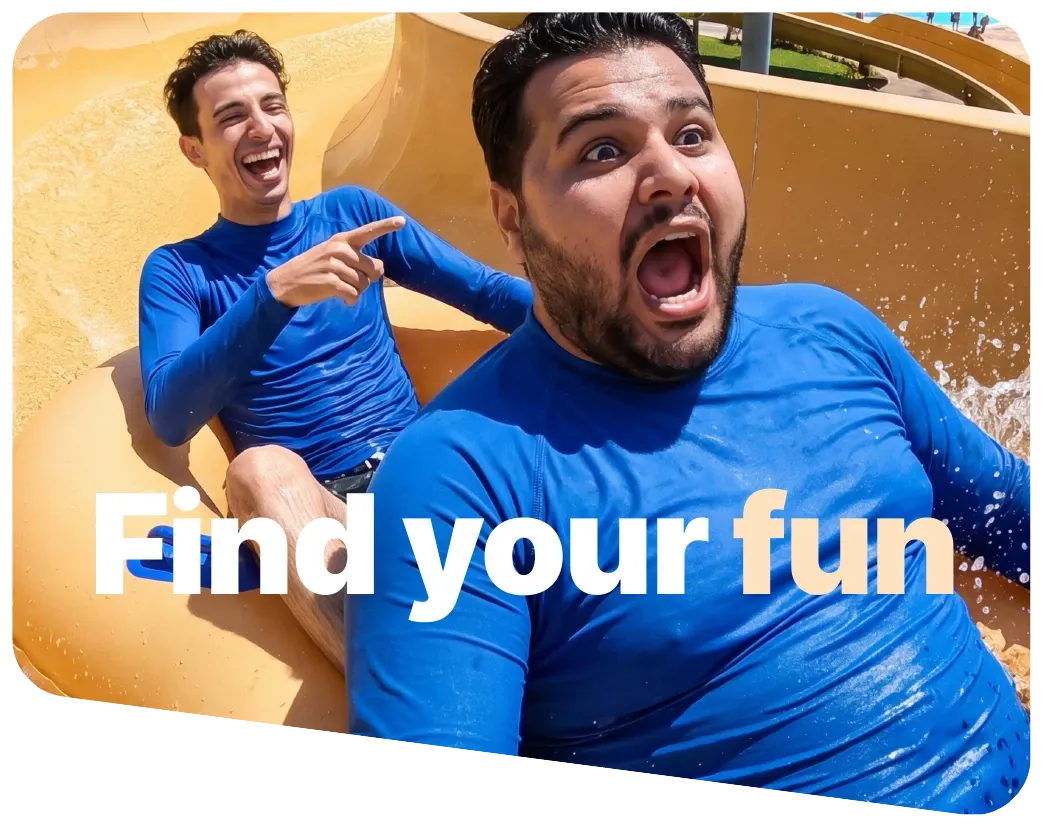
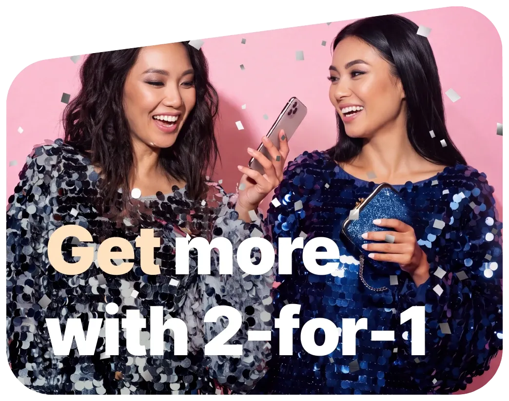
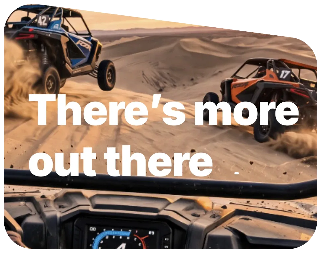
For phrases, sentences or headlines of more than two words, use sentence case: capitalise the first word and retain the correct styling of brand names and proper nouns.
Keep it to 2 to 6 words that fit within 2 lines.
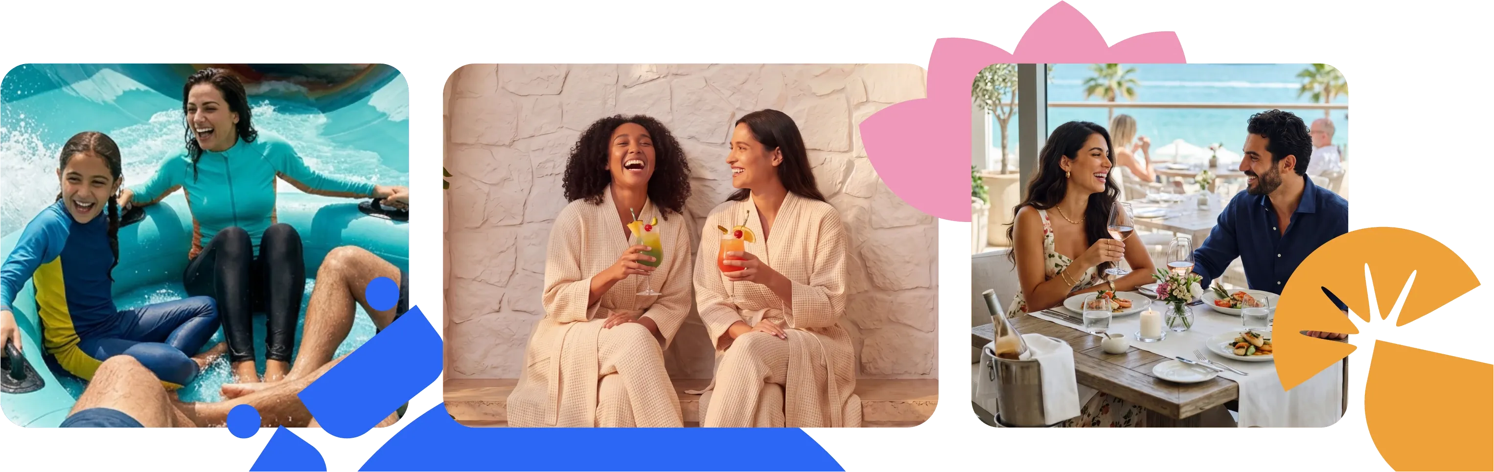
Lifestyle images
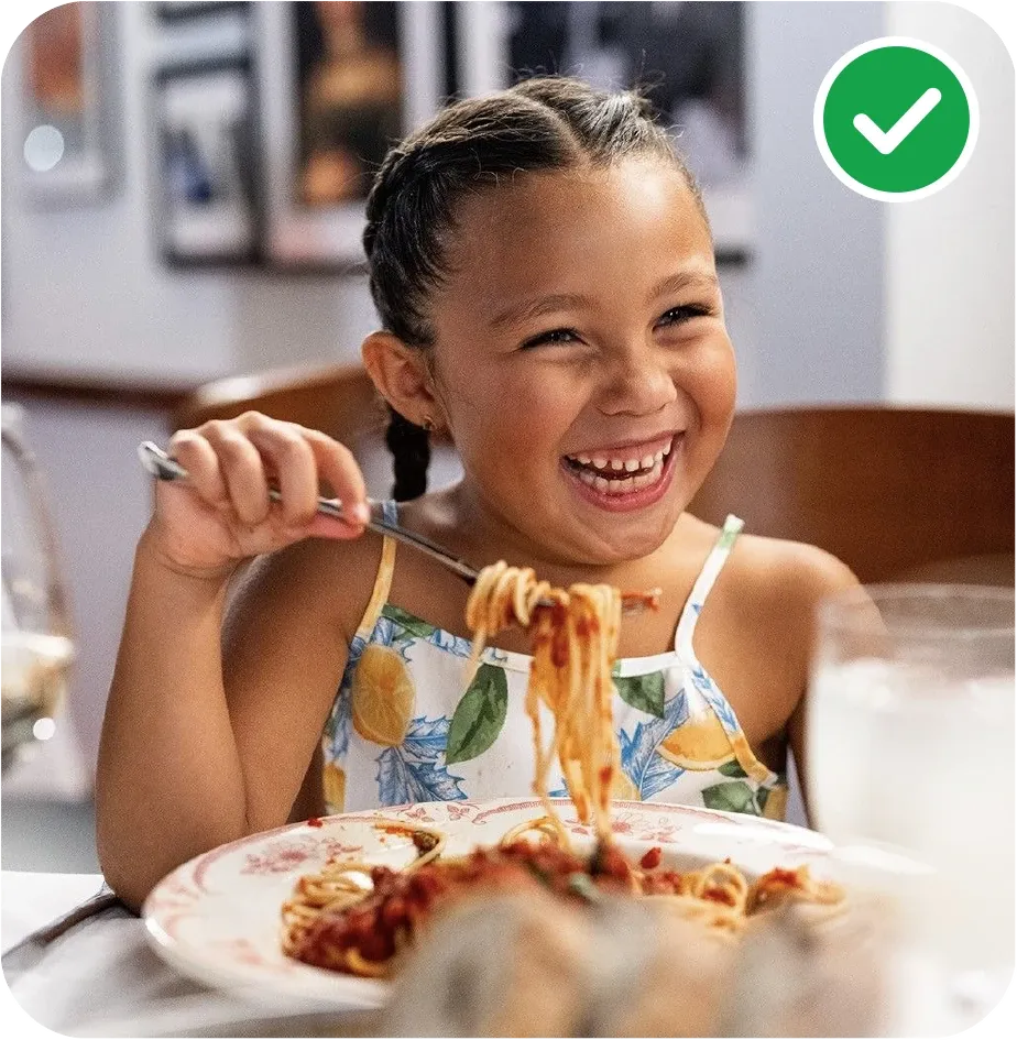
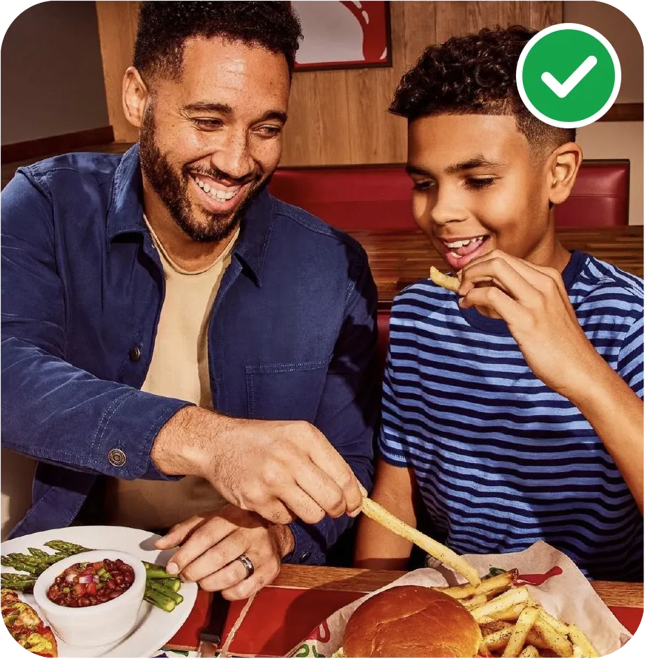
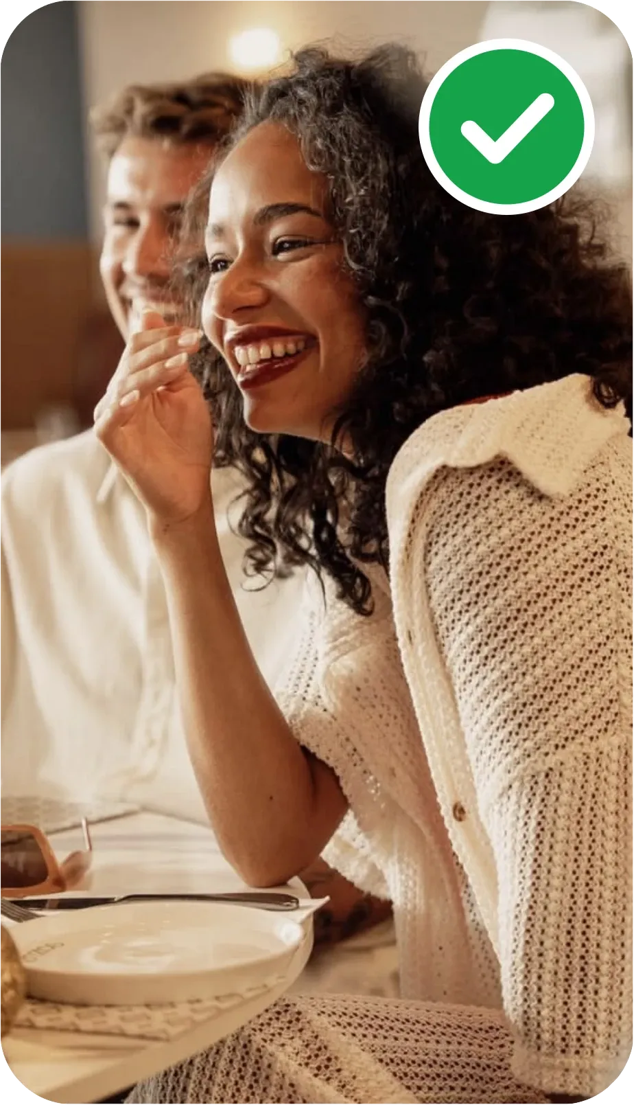
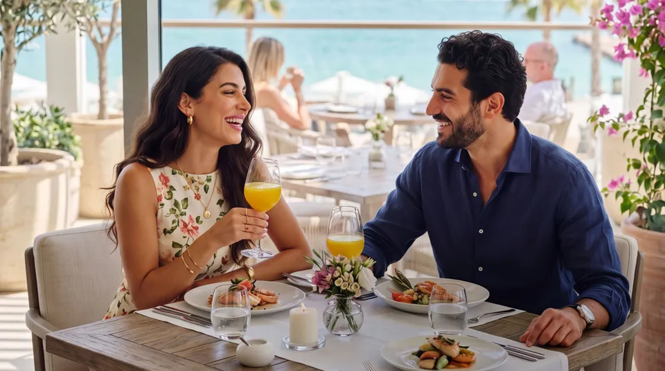
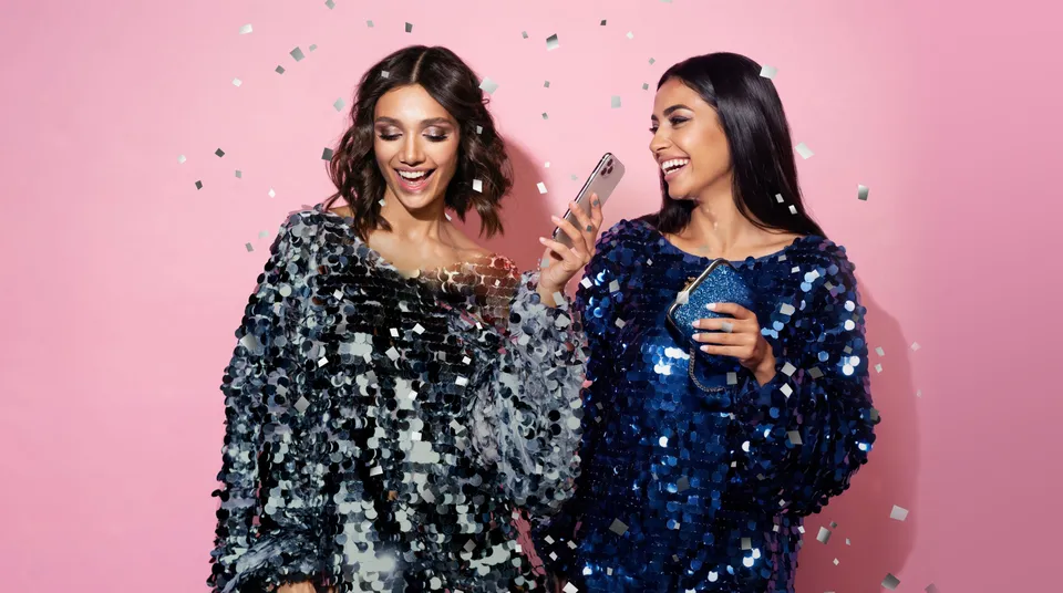
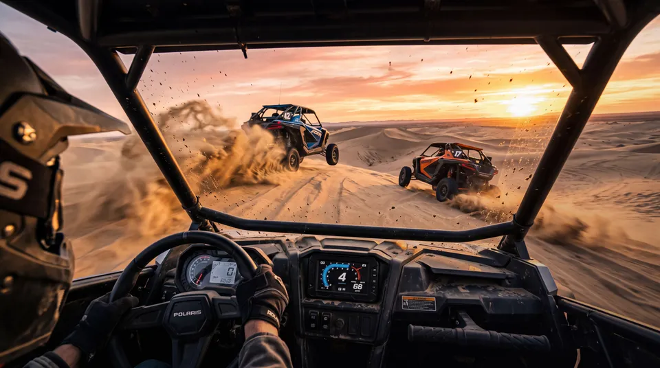
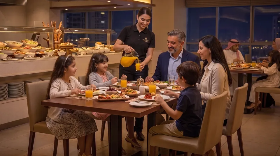
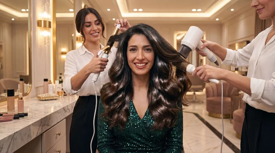
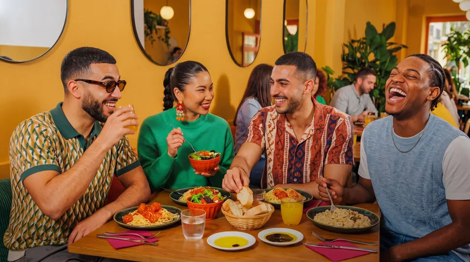
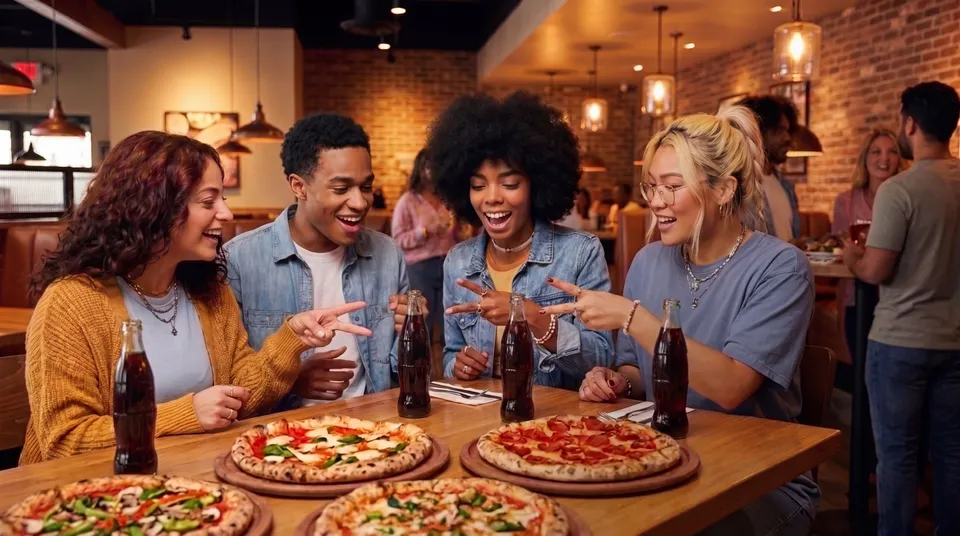
the ENTERTAINER's imagery should reflect an affordable, attainable lifestyle, aspirational without feeling distant or exclusive. It should feel warm, lively and inviting, capturing moments that are fun, exciting and effortlessly enjoyable. Never cold, overly polished or pretentious.
Lifestyle don'ts
Imagery plays a key role in the ENTERTAINER's identity, shaping first impressions and communicating what the brand stands for. the ENTERTAINER is about experiences. Our images should capture genuine emotions and candid moments that feel authentic and relatable. Follow these non-negotiable rules when choosing images:

Don't use busy images without a clear subject or focal point. 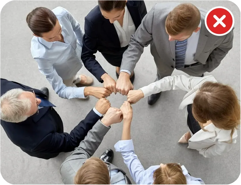
Don't use corporate clichés, such as people in suits shaking hands.

Don't use cartoon-style illustrations, outdated icons and symbols. 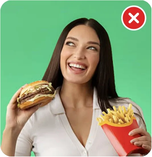
Don't use overly staged studio photos. Choose natural, candid moments that feel authentic. 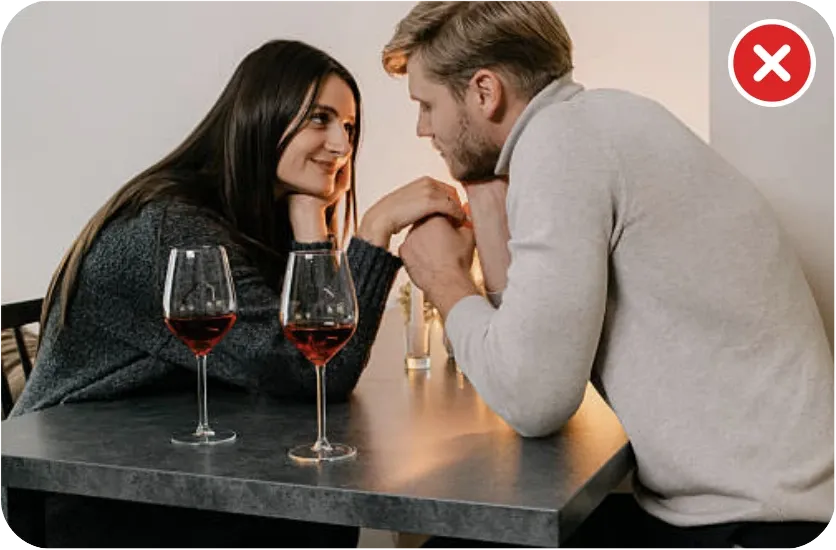
Don't use images of couples in overly intimate or suggestive poses.
AI images
AI-generated images are encouraged when they feel realistic, natural and emotionally engaging. They should capture genuine human emotion, candid moments, fun and spontaneity. If required, disclose that the image is AI-generated.
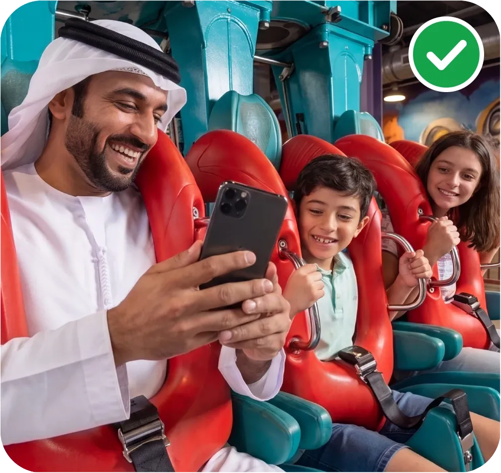
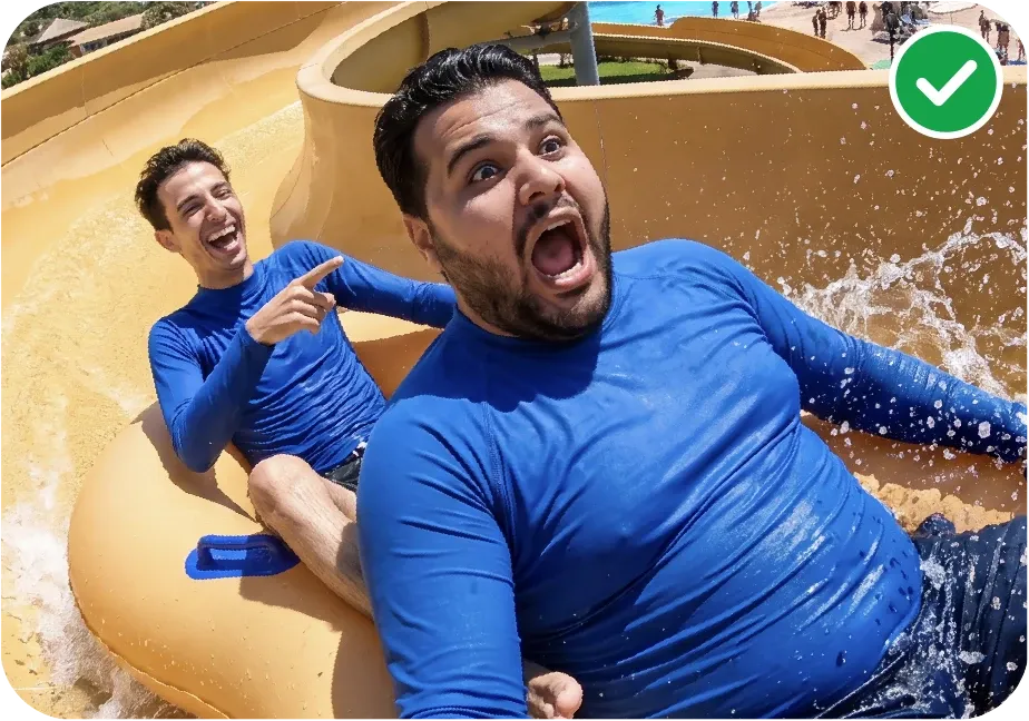
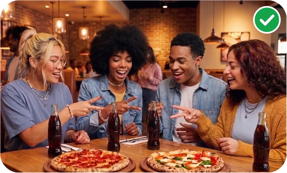
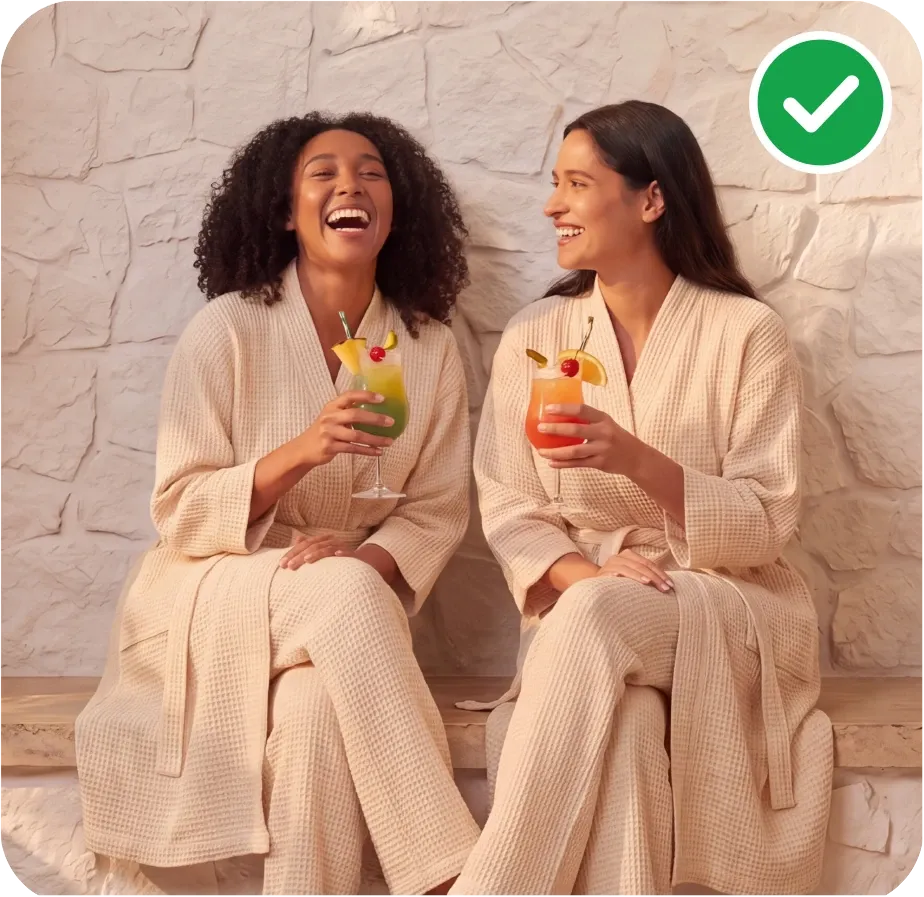
AI don'ts
When creating AI content, whether image or video, make sure it represents near-real-life situations, with natural facial expressions, proper skin tone and clothing, and that it is culturally accurate.
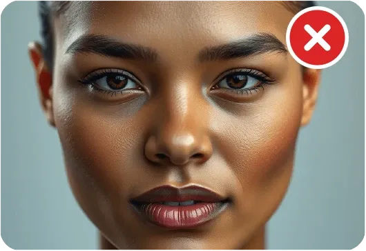
Don't use plastic-looking skin. 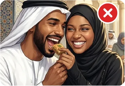
Don't use culturally inappropriate or incorrect clothing. 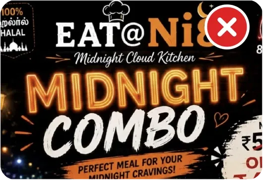
Don't generate text within AI images. 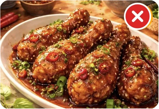
Don't use unnatural food imagery. 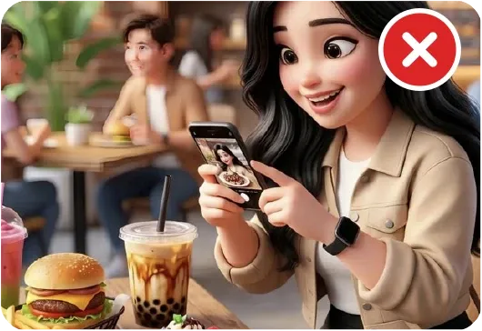
Don't use stylised or cartoon-like imagery. 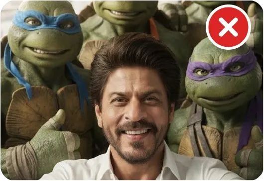
Don't use known personalities or characters.
Image library
Lifestyle images ready to use, each with and without the logo, in one ZIP.
Iconography
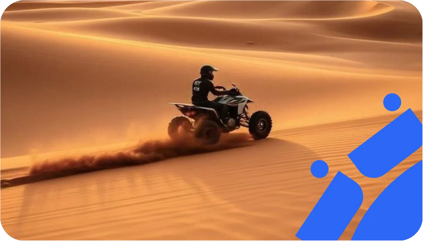
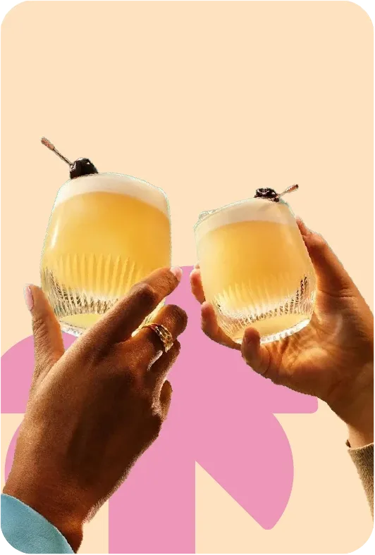
the ENTERTAINER's simplified graphic icons are inspired by our offer categories. They support our communications as graphic backgrounds or combined with lifestyle imagery.







Background element
Graphic icons can be used as supporting background elements. Position them where they complement the layout, maintaining balance without distracting from the main message.

Image accent
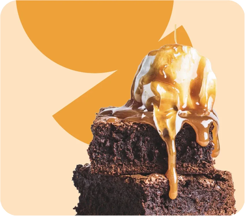
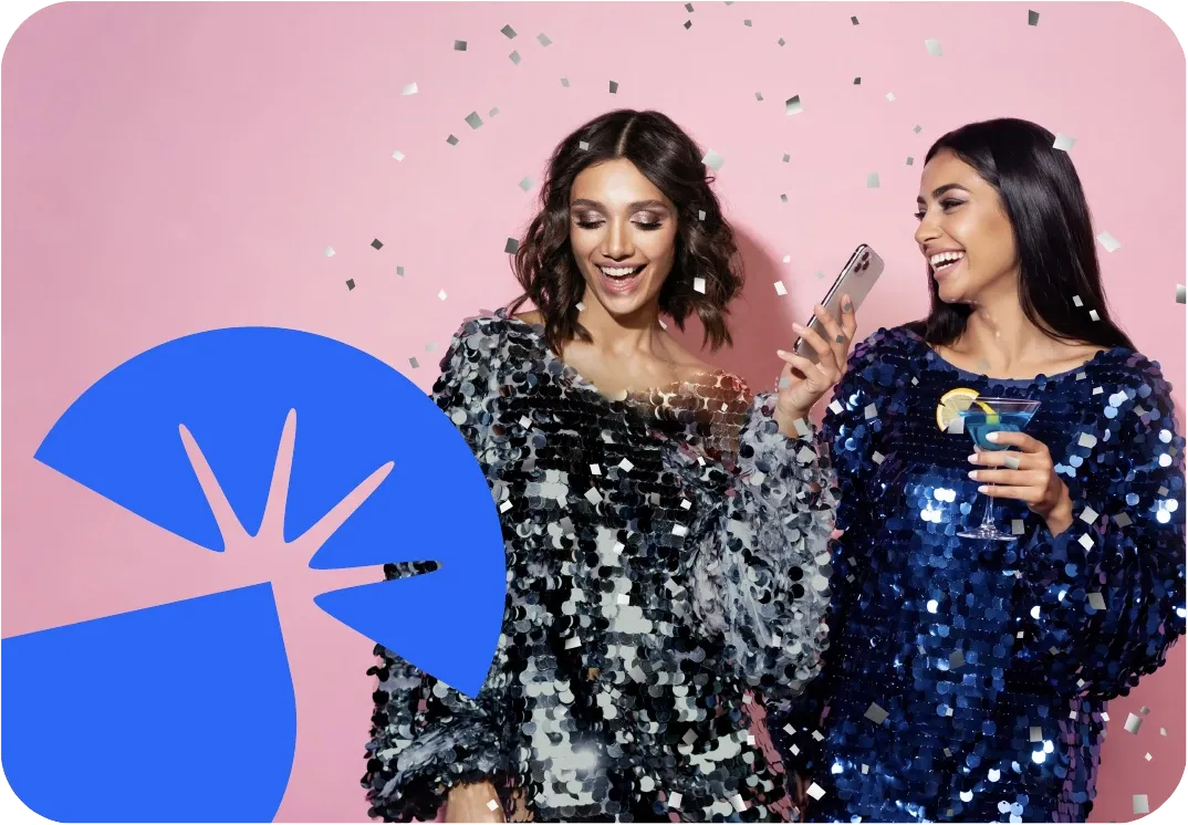
Graphic icons can be used as branding elements over clean, simple lifestyle images. Place them in front of or behind the subject, ensuring they complement the image without creating clutter.
Connecting element
Graphic icons can connect multiple images, weaving between them to create an intertwined effect and a natural visual flow.